Skip to content
 In this tutorial, we will see how to create a shared layout for all the views that is also responsive for websites, desktops, and mobile applications.
We will cover the following 💻📱:
- Add a side navbar to the layout
- Create Main Layout
- Create a view (using the layout)
- Add responsive-grid for setting responsive like in Bootstrap
- Configure MaterialApp
- Set up the navigation
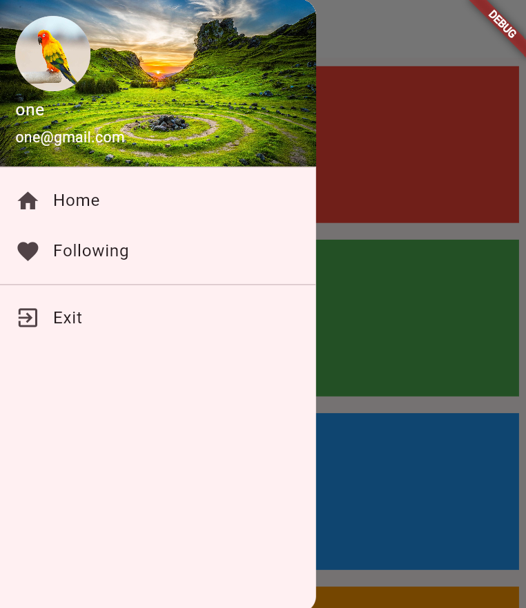
Responsive Layout
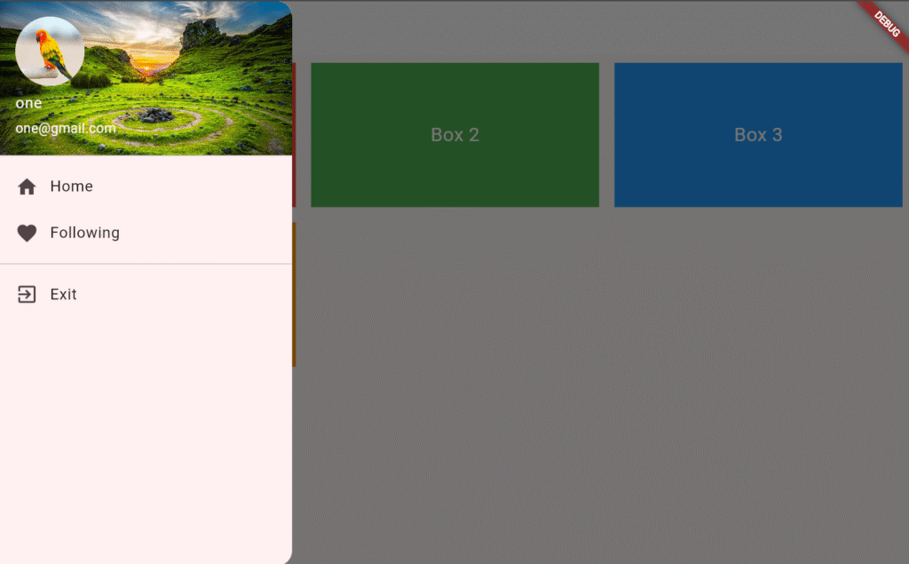
Add a Side Navbar
To define the sidebar, we will use the following code:
- Create a StatelessWidget
- Fill a Drawer with our items
- Create a ListView and add all the children and their details
- UserAccountsDrawerHeader will allow us to show the active user information
- To show images, you can download them and create a new folder at the root
assets/images/my_pic.png, and uncomment assets in the pubspec.yaml to add assets: assets/images/, finally, just runflutter pub get - ListTile is used for adding navigation links
- To show images, you can download them and create a new folder at the root
- Fill a Drawer with our items
lib/Layout/navbar.dart
import 'package:flutter/material.dart';

class NavBar extends StatelessWidget {
  const NavBar({super.key});

  @override
  Widget build(BuildContext context) {
    return Drawer(
      child: ListView(
        padding: EdgeInsets.zero,
        children: [
          UserAccountsDrawerHeader(
            accountName: Text('one'),
            accountEmail: Text('one@gmail.com'),
            currentAccountPicture: CircleAvatar(
              child: ClipOval(
                child: Image.asset(
                  'assets/images/bird.jpg',
                  fit: BoxFit.fill,
                  width: 90,
                  height: 90,
                ),
              ),
            ),
            decoration: BoxDecoration(
              color: Colors.blue,
              image: DecorationImage(
                image: AssetImage("assets/images/paradise.jpg"),
                fit: BoxFit.cover,
              ),
            ),
          ),
          ListTile(
            leading: Icon(Icons.home),
            title: Text('Home'),
             onTap: () => Navigator.pushNamed(context, '/'),
          ),
          ListTile(
            leading: Icon(Icons.favorite),
            title: Text('Following'),
            onTap: () => Navigator.pushNamed(context, '/following'),
          ),
          Divider(),
          ListTile(
            leading: Icon(Icons.exit_to_app),
            title: Text('Exit'),
            onTap: () {},
          ),
        ],
      ),
    );
  }
}
Create Main Responsive Layout
Now, let’s create the main_layout.dart which will add the navbar and define the child (elements that will use the layout)
lib/Layout/main_layout.dart
import 'package:flutter/material.dart';
import 'navbar.dart';

// ignore: must_be_immutable
class MainLayout extends StatelessWidget {
  Widget child;
  String title;
  MainLayout({required this.title, required this.child, super.key});

  @override
  Widget build(BuildContext context) {
    return Scaffold(
      appBar: AppBar(title: Text(title)),
      drawer: NavBar(),
      body: Container(child: child),
    );
  }
}
Create a view (using the layout)
We will create two views that use MainLayout to validate if the navigation works:
- lib/Views/following.dart: This view will only display the text Following
- lib/Views/home.dart: This view will display the
responsive-gridwhich shows how to set up items in a responsive framework like Bootstrap, by defining how many elements per row.- Add the next dependencies to
pubspec.yamland runflutter pub get:- responsive_framework: ^1.1.0
- responsive_grid: ^2.4.4
- Add the next dependencies to
lib/Views/following.dart
import 'package:flutter/material.dart';
import 'package:mvp_platform/Layout/main_layout.dart';

class Following extends StatelessWidget {
  const Following({super.key});

  @override
  Widget build(BuildContext context) {
    return MainLayout(
        title: "Following",
        child: SingleChildScrollView(
          child:  Text("Following"),
        ),
    );
  }
}
lib/Views/home.dart
import 'package:flutter/material.dart';
import 'package:mvp_platform/Layout/main_layout.dart';
import 'package:responsive_grid/responsive_grid.dart';


class Home extends StatelessWidget {
  const Home ({super.key});

  @override
  Widget build(BuildContext context) {
    return MainLayout(
      title: "Home",
       child: SingleChildScrollView(
          child: ResponsiveGridRow(
            children: [
              ResponsiveGridCol(
                xs: 12,
                sm: 6,
                md: 4,
                lg: 3,
                child: MyBox(label: "Box 1", color: Colors.red),
              ),
              ResponsiveGridCol(
                xs: 12,
                sm: 6,
                md: 4,
                lg: 3,
                child: MyBox(label: "Box 2", color: Colors.green),
              ),
              ResponsiveGridCol(
                xs: 12,
                sm: 6,
                md: 4,
                lg: 3,
                child: MyBox(label: "Box 3", color: Colors.blue),
              ),
              ResponsiveGridCol(
                xs: 12,
                sm: 6,
                md: 4,
                lg: 3,
                child: MyBox(label: "Box 4", color: Colors.orange),
              ),
            ],
          ),
        ),
      );
  }
}

class MyBox extends StatelessWidget {
  final String label;
  final Color color;

  const MyBox({super.key, required this.label, required this.color});

  @override
  Widget build(BuildContext context) {
    return Container(
      height: 150,
      margin: EdgeInsets.all(8),
      color: color,
      child: Center(
        child: Text(label, style: TextStyle(fontSize: 20, color: Colors.white)),
      ),
    );
  }
}
Configure MaterialApp
Here, we will define the routes, theme for our whole application and set the home page.
lib/main.dart
import 'package:flutter/material.dart';
import 'package:mvp_platform/Views/following.dart';
import 'package:responsive_framework/responsive_framework.dart';
import 'Views/home.dart';

void main() {
  runApp(const MyApp());
}

class MyApp extends StatelessWidget {
  const MyApp({super.key});

  // This widget is the root of your application.
  @override
  Widget build(BuildContext context) {
    return MaterialApp(
      title: 'MyMvp',

      theme: ThemeData(
        colorScheme: ColorScheme.fromSeed(seedColor: Colors.black),
        appBarTheme: AppBarTheme(
          backgroundColor: Colors.white, // Match your theme
          foregroundColor: Colors.black, // Text/icon color
          elevation: 0,
        ),
      ),
      builder:
          (context, child) => ResponsiveBreakpoints.builder(
            child: child!,
            breakpoints: [
              const Breakpoint(start: 0, end: 450, name: MOBILE),
              const Breakpoint(start: 451, end: 800, name: TABLET),
              const Breakpoint(start: 801, end: 1920, name: DESKTOP),
              const Breakpoint(start: 1921, end: double.infinity, name: '4K'),
            ],
          ),
      routes: {
        '/homepage': (ctx) => Home(),
        "/following": (ctx) => Following(),
      },
      home: Home(),
    );
  }
}
Finally, you have a shared layout, feel free to customize the code, Happy coding 🙂 !